Merz Aesthetics Toolkit Layouts
This will be a brief overview of the website layout, as well as methods of adding content. For front-end developers, it should be noted that the site layout relies heavily on FlexBox . As of September 2020, 98.69% of installed browsers (99.29% of desktop browsers and 100% of mobile browsers) support CSS Flexible Box Layout.[wikipedia]
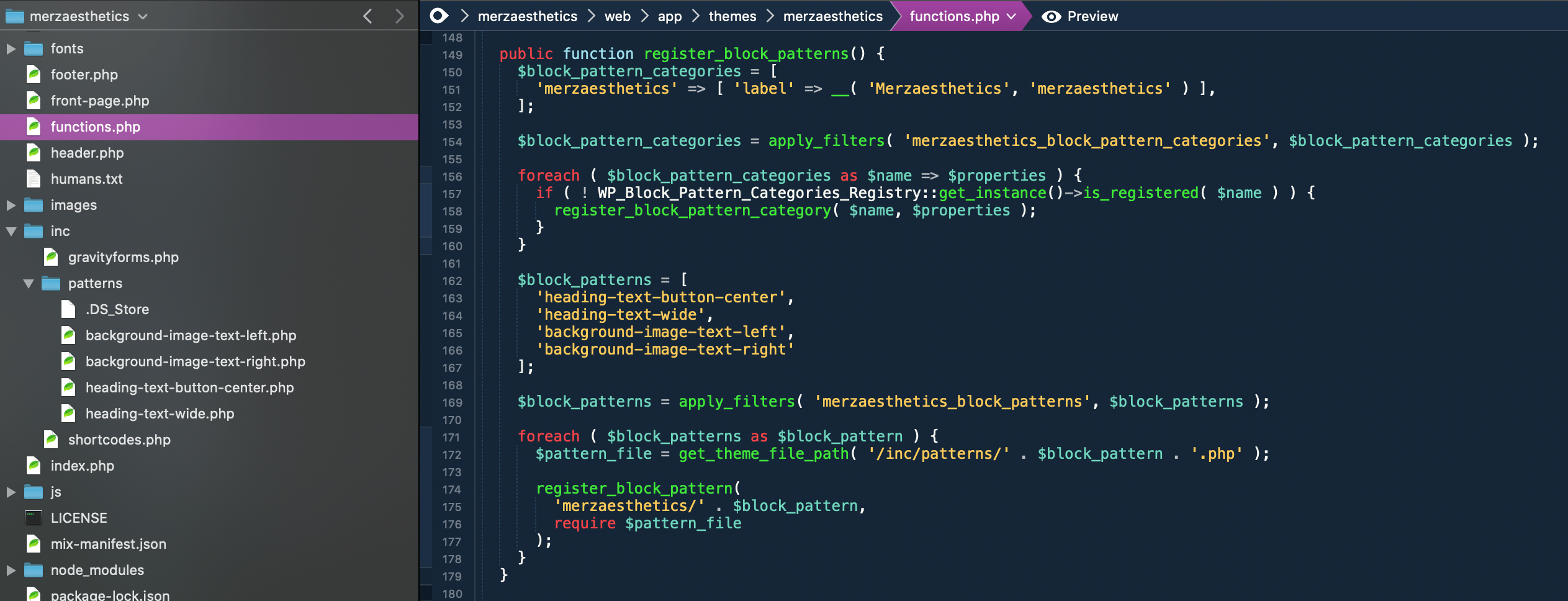
To add new content sections to this site, we take advantage of the Gutenberg editor which ships with WordPress.

Clicking on the Add Block button will bring up Blocks and Patterns. Patterns are special combinations of blocks which have specific CSS classes and structure to mimic Bootstrap 4‘s grid framework.
I have also circled ‘List View’. I find it makes navigating all the different blocks much easier, since you can see them on the left of the screen. If your page has many headings, paragraphs, columns, and images, this panel should be left open at all times.
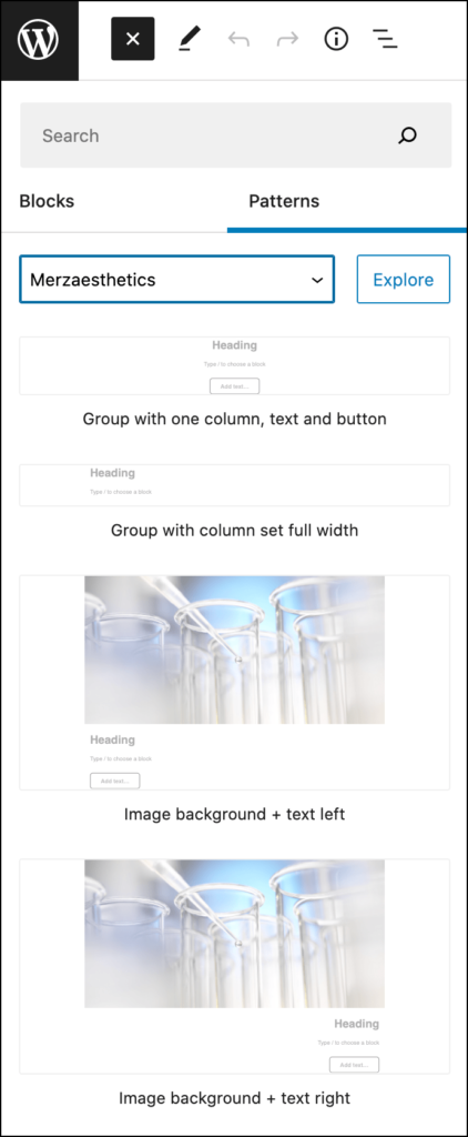
Common patterns for this site have been categorized with “Merzaesthetics”. Clicking any of these patterns will insert them in the page.
Bootstrap classes
Group classes
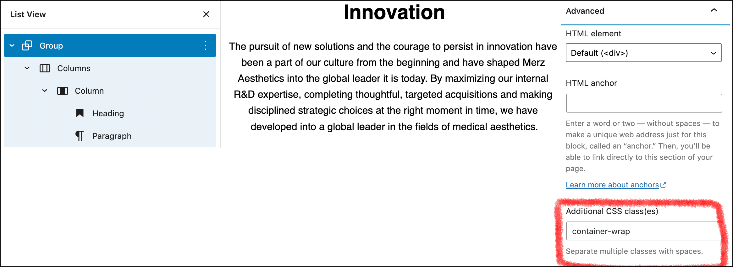
This is the pattern Group with one column, text and button on the Innovation page. The button was removed from the column but what is important here is the class name on the group. The class ‘container-wrap’ is set on the group, and that gives the content a max-width for different screen widths, similar to Bootstrap’s ‘container’ class. Group is actually made up of two divs, an outer div and an inner div and ‘container-wrap’ puts the max-width on the inner class. This gives us more flexibility. For example, we might want a background color to go the full width of the page, but keep the content constrained to a maximum width. By placing additional color classes on the ‘container-wrap’ group we can do this.
Column classes
Column classes are set to mimic Bootstrap grid. This one defaults to ‘col-12 col-md-9 col-lg-8 text-center mx-auto’, which means:
- Full width at small size screens
- 9 columns at the ‘medium’ size
- 8 columns at the ‘large’ size
- center text at all sizes
- set margin on the x-axis to auto
More info on Bootstrap’s website.

Background image with text

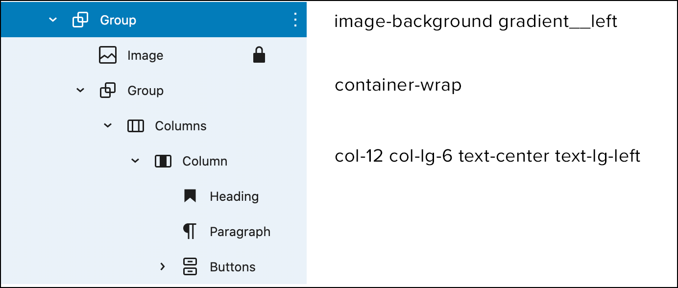
Some content sections require a background image. See Innovation page for an example of this section. This pattern is similar to the previous pattern (group, columns, column) but is is a child of another group. The parent group has ‘image-background gradient__left’ classes. The gradient basically goes ‘to the left’ or ‘to the right’ so text over the image is more visible. Remove the gradient class if you don’t need it.
Fonts, colors, layout best practices
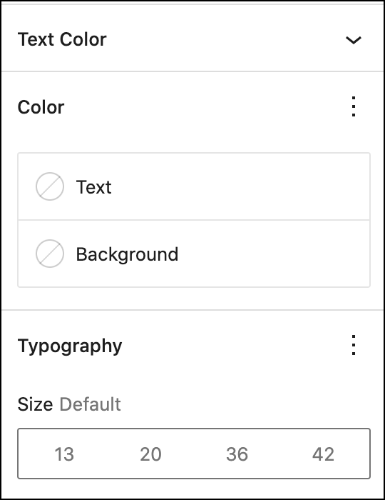
I highly recommend doing all your styling in the theme. The block panels on the right make it simple to add inline styles. You should avoid setting colors and fonts in these panels since it will create headaches for you when you need to update global font styles, or brand colors.
web/app/themes/merzaesthetics/scss/base/_variables.scss
Take advantage of Bootstrap’s variables. In this file you will find all the Bootstrap variables in which we are overriding values. Setting variables in the theme will make maintaining the site much easier. Most of the commonly used ones (and there are many!) we pasted in this file.
Use Bootstrap column classes to update layout.
True, when you click on a Columns block, you will see a slider in which you can set a percentage. It can be tempting to use this slider. However, using Bootstrap column classes will give you much more fine-grained control.
Take this Group in which you are currently reading:
- Column on left (image): ‘col-md-4’
- Column on right (text): ‘col-md-8’
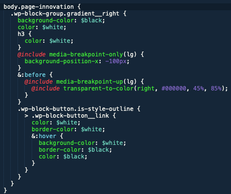
Every page has an additional unique body class based on the URL slug. For example, the “Innovation” page has a body class of .page-innovation which you can use to target common elements for tweaks. For the Innovation page, we used the Pattern we discussed earlier (background image + text + gradient) and a small change was needed to make the gradient black. So in order to set custom colors, we targeted just that gradient on that particular page with CSS.

